First Impressions: Motorola Q Smartphone
My colleague, Erik Larkin, met with Motorola earlier today and hand-carried our evaluation unit back to PC World's offices--where several of us have been eager to get our hands on the much-anticipated Motorola Q (follow the link for more details on the Q and Verizon's service offerings). I snagged it first, and have a few initial thoughts to share about its industrial design.
Like the Razr before it, the Q clearly aims to make a fashion--as well as technophile--statement. Slim and stylish, the silver-hued Q is just 11.5mm thick--less than the Razr, and significantly more compact than competing smartphones from Palm, T-Mobile, HP, and Research in Motion. It would easily slide into a shirt or jacket pocket, and at 4.1 ounces, it won't even leave a dent.

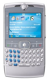
Based on its design, the Windows Mobile 5-based Q is trying to create a new hybrid that draws upon the best elements of the latest smartphones from Palm (maker of the Treo 700 series) and RIM (maker of the BlackBerry 8700 series). It has a BlackBerry-like click wheel to scroll through content, at the upper right corner of the phone. And it has five-way navigational control, plus a QWERTY keyboard and six menu navigation buttons in the center, just like the Palm Treo series has. The menu navigation buttons here are pressure-sensitive and soft, though--a design point that's reminiscent, though not identical to, the flat buttons on the Razr.
As appealing as I found the overall look of the Q--and as impressed as I am with what this phones packs inside its streamlined chassis--I was disappointed by its design in several aspects. The keyboard's lack of a backspace button among the QWERTY keys proved problematic for me. I also found the click-wheel a bit stiff, and the soft key panel surprisingly tough on my fingers to navigate--in part because of the width of the unit (as compared with the more palm-friendly Palm Treo 700), and in part because I found it annoying to move over the deep rim surrounding the five-way nav control to the two upper soft keys. Those soft keys, to the right and left of the five-way nav control are integral for navigation. And given the unit's lack of a touchscreen, how your hand responds to the feel of the buttons will determine how much you enjoy using the Q.
Another gripe: The position of the mini-USB port. I know I've often used a cell phone while it's tethered to an outlet, getting its necessary juice. However, the mini-USB port--which doubles as the power port--is awkwardly situated on the lower left of the Q. This is incovenient if you try to use the device in your hands--either for reading content, or putting it up to your ear.
Some things I really liked: I found the keyboard, with its slanted, oblong keys, roomy as compared to the Treo, and easier to handle than the much-wider BlackBerry 8700 series. Other strengths: The Q has a bright, clear QVGA 320 by 240 resolution display, and its 1.3 megapixel digital camera has a reasonably effective 6X zoom.
Stay tuned: We'll post further reports on the Q's design, usability, and performance as we have them.
Source: PC World
Like the Razr before it, the Q clearly aims to make a fashion--as well as technophile--statement. Slim and stylish, the silver-hued Q is just 11.5mm thick--less than the Razr, and significantly more compact than competing smartphones from Palm, T-Mobile, HP, and Research in Motion. It would easily slide into a shirt or jacket pocket, and at 4.1 ounces, it won't even leave a dent.

Based on its design, the Windows Mobile 5-based Q is trying to create a new hybrid that draws upon the best elements of the latest smartphones from Palm (maker of the Treo 700 series) and RIM (maker of the BlackBerry 8700 series). It has a BlackBerry-like click wheel to scroll through content, at the upper right corner of the phone. And it has five-way navigational control, plus a QWERTY keyboard and six menu navigation buttons in the center, just like the Palm Treo series has. The menu navigation buttons here are pressure-sensitive and soft, though--a design point that's reminiscent, though not identical to, the flat buttons on the Razr.
As appealing as I found the overall look of the Q--and as impressed as I am with what this phones packs inside its streamlined chassis--I was disappointed by its design in several aspects. The keyboard's lack of a backspace button among the QWERTY keys proved problematic for me. I also found the click-wheel a bit stiff, and the soft key panel surprisingly tough on my fingers to navigate--in part because of the width of the unit (as compared with the more palm-friendly Palm Treo 700), and in part because I found it annoying to move over the deep rim surrounding the five-way nav control to the two upper soft keys. Those soft keys, to the right and left of the five-way nav control are integral for navigation. And given the unit's lack of a touchscreen, how your hand responds to the feel of the buttons will determine how much you enjoy using the Q.
Another gripe: The position of the mini-USB port. I know I've often used a cell phone while it's tethered to an outlet, getting its necessary juice. However, the mini-USB port--which doubles as the power port--is awkwardly situated on the lower left of the Q. This is incovenient if you try to use the device in your hands--either for reading content, or putting it up to your ear.
Some things I really liked: I found the keyboard, with its slanted, oblong keys, roomy as compared to the Treo, and easier to handle than the much-wider BlackBerry 8700 series. Other strengths: The Q has a bright, clear QVGA 320 by 240 resolution display, and its 1.3 megapixel digital camera has a reasonably effective 6X zoom.
Stay tuned: We'll post further reports on the Q's design, usability, and performance as we have them.
Source: PC World


No comments:
Post a Comment